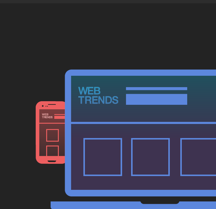
The Latest Web Trends Or The Era Of Large Images
Wed 05 Jul 2017
- Full-width images
- Parallax Scrolling
- Flat design and bright colors
- and more
It’s time to talk about the new and most popular trends that are emerging and shaping the web’s look and feel. Discover them below:
- Full-width images: Images of happy and smiling people can convey an emotion, and we know that when people connect emotionally they are more likely to convert. Today, although we still need to be aware of minimizing the overall file size, technology has changed and Internet speed is wrapping up allowing more and more websites to go for larger images and a few even to full-screen video. Some sites are even going for less text and more images at least on the Homepage, which is less SEO friendly, but does speaks to the end-user.
- Example of sites using full-width images: Christmas Express
- Cinemagraph: Cinemagraph are GIF images or video animations, that are made of still images and have only one minor element of the image moving. They create a nice effect on the websites.
- Scrolling Experiments: Users are now browsing mostly mobile, hence design is now catering more to smaller screens. This technology shift led to simplified navigation, more scrolling, more freedom, but it also came with negative circumstances such as SEO negative effect and longer loading times. Introduction of techniques such as Parallax Scrolling has become more and more trendy: the background moving at a slower rate to the foreground, creating a 3D effect as you scroll down the page.
- Example of parallax scrolling site: Every Last Drop (how to save water site) and Lost World Fairs Atlantis
- Some websites even dare go to double scrolling, such as this website : http://www.fadeoreddy.com/
- Scrolljacking : Scrolljacking is the technique that displays the content as a set of slides instead of the traditionally vertical scrollbar. In scrolljacking, a website doesn't scroll down as how user expects when using the mouse wheel, but executes an animated function. It has received mixed reactions, but many websites are trying out this new feature . Example of a website using scrolljacking: http://www.world-of-swiss.com/en#cseries
- Simplified navigation (less is more): With too many options, people are less likely to convert. Successfully prioritizing where you want your users to go is essential. You can do that by either placing navigation under a hamburger menu, having a prioritized navigation, or having a display of card design layout. Indeed, this Pinterest-inspired trend is a way to adapt to mobile screen size, in which we have content organized in cards layout, including only what’s necessary.
- Example of website using card layout : Pierrik Calvez
- Front-page Carousels:

Whether you call them slideshows, rotating banners, multiple offers, or carousels, they have negative effects on SEO as they take up space with little content, and usually take time to load. Still they are very popular as they can add visual interest, and reduce clutter by letting you put lots of content on the first screen.
- Flat design and bright colors:

The 2015 flat design trend was characterized by simplicity, minimalist elements, highlights, drop shadows. Bright, "positive" colors were often used for call for actions, and are sometimes used with a monochromatic background palette for a full contrast.
- Split-screen layouts:

Quite a practical way of splitting your homepage into 2 when you have more than one service, product or category. It helps your user directly go to your conversion pages.
- Motion Design and Interactions:

Along with the long scrolling feature, came animation and animated interactions. Examples of Interactions are clickable/swipe-able elements, the roll over revealing more content or animations to express successful interactions.
- Artistic photographs: More and more sites relied on artistic photographs instead of digital graphics. With the rise of high definition and retina displays; resolutions allowed photographs to render nicely on mobile.
- Bold Typo, Intentional: A sans serif typeface set in a bold styling typography was often used to match the simple layout, and minimalistic trend of the year. Also designers were playing with the size of the typography, displaying it in extreme small or big sizes.
ConclusionNew trends are emerging as we are following technological advancements.
Our advice is to be wise and clever about which trends to follow, and to always try to experiment and stay away from standardisation.
User's experience and needs should dictate your design, before trends.
Finding the right balance between following new trends, and keeping SEO in mind is the way to move forward, until the day search engines can really read images contents!
trends
online
Web design
user experience
WHAT DO YOU THINK ?
RELATED